Becca is a freelance Canadian illustrator who loves style exploration. Her digital illustrations are graphic, two-dimensional, and pop-art inspired.
Cover illustration for the Best in the Core feature in Edmonton's community publication, The Yards.
Tell your story through your brand identity. Becca asks a lot of questions, so be prepared for a professional who really gets to know your business.
The Students’ Association of MacEwan University (SAMU) is committed to helping students connect with their peers and provides a place to explore that. There are more than 100 student clubs representing different interests, causes, and activities.
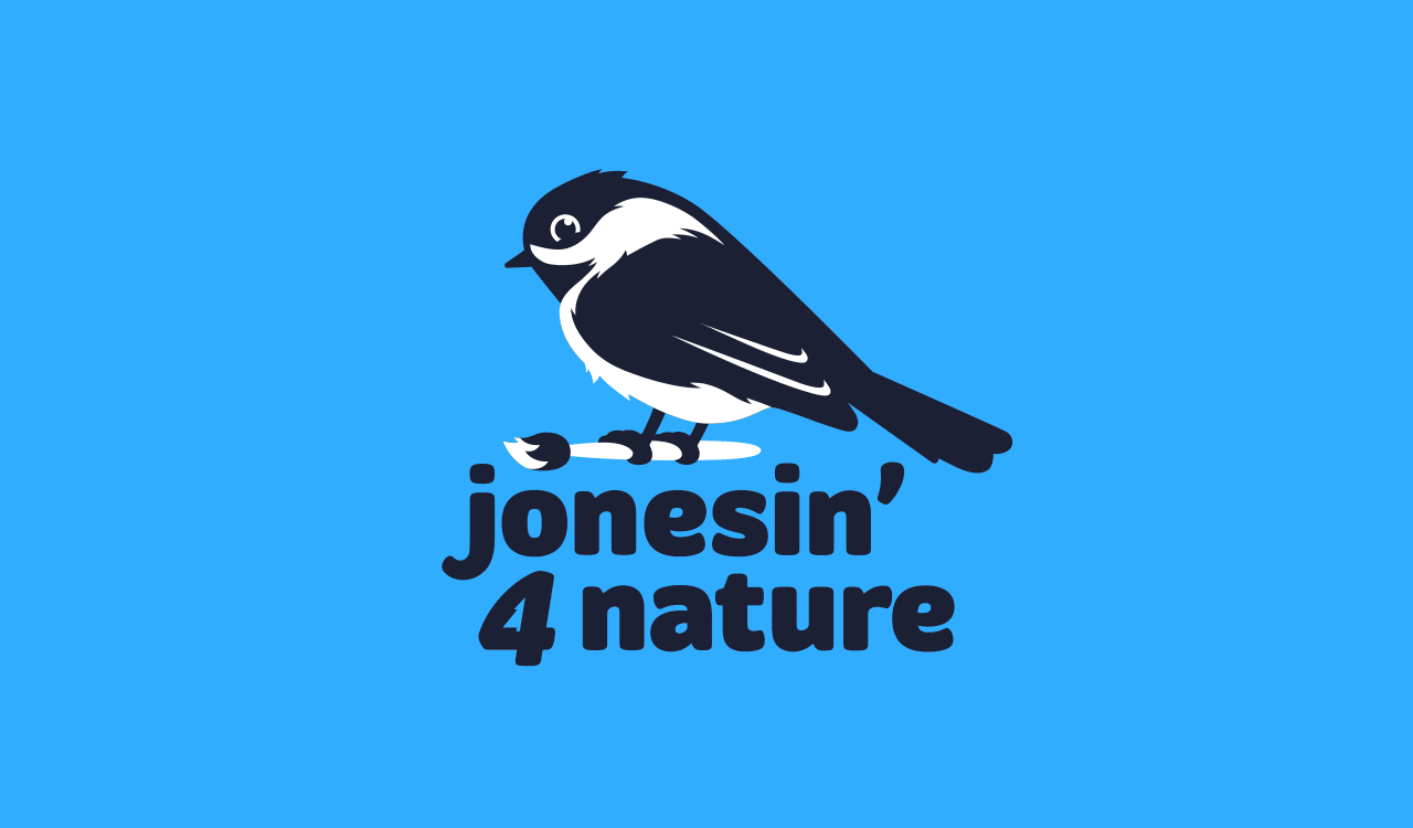
In 2019, the SAMU Clubs department became Student Groups, an umbrella term that better reflected all associations, special interest groups, and clubs on campus.
Tasked with redefining the visual identity, I created a new brand for Student Groups.
This was a great opportunity to inject a boost of energy. With connection and community in mind, I designed a ligature between the n and o to create a literal connection between the words. Romana, a serif typeface, was chosen for its classic and respectable traits—lending legitimacy to Student Groups—and the letters were customized to give the wordmark a playful, youthful feel.
You’ll see many examples of how the logo was applied below.
I was approached by Sled Island, alongside eleven other talented designers, to get involved with the annual poster show that pairs artists with musicians to create limited edition, hand-silkscreened posters.
Meet Silver Apples, a psychedelic electronic band that formed in the late 60s. Inspired by the experimental, interstellar melodies, I created a poster with vibrating colours and psychedelic type to produce a surreal design that reflects the band’s origin.
One great thing that came out of 2020 was getting the opportunity to design the event branding for SAMU’s Speaker Series: Jameela Jamil. I recommend The Good Place to anyone who will listen, and I love that Jameela isn’t afraid to speak her mind. Her podcast, I Weigh, creates a space to explore diet culture, body positivity, feminism, cancel culture, shame, mental health, and so many other social issues.
Illustrating the title letterforms connected the design to the speaking topics and Jameela as a person. While fonts are designed to be flexible and readable, hand-lettering has a distinct voice that feels more honest and human.
On October 26, 2018, Tegan and Sara spoke at MacEwan University as part of the SAMU Speaker Series. Joined by Vivek Shraya as their moderator, the evening covered topics such as identity, expression, and authenticity.
As identical twins, I thought that symmetry and repetition would suit the collateral. Pulling inspiration from their sweaters, I created a pattern and colour palette that pulled the photograph and type together into a cohesive design.
Elections are a very important component to students’ associations because they bring student leadership to the organization. Running an election awareness campaign is necessary to encourage students to participate by either running as a candidate or voting, so the call-to-action needs to be clear.
The Students’ Association of MacEwan University (SAMU) needed a visual identity that was nonpartisan and consistent to differentiate these elections from municipal, provincial, or federal Get Out the Vote campaigns.
Using the gavel as a starting point and a visual cue for governance, the graphics are reductive to get the point across quickly. The colour combination was chosen for its strong contrast and sense of urgency.
Every year, the Students’ Association of MacEwan University (SAMU) provides a free agenda to all students. This year in particular was different because we also created a suite of swag to match.
Just slapping a logo on a product doesn’t give your audience anything to interact with. Instead of going the literal route, I created handlettered labels that described what each product really does for us.
As an annual recruitment effort, the Work Here design system was created to get post-secondary students interested in part-time opportunities with the Students’ Association of MacEwan University (SAMU).
A typographic approach was taken to stand out from the highly illustrated style of other posters on campus and drove students to the job postings online.
Job fair cards were created so that students could jot down the positions that piqued their interest. Perforated, tear-off tabs on the posters were a hit and every poster was found empty in a week.
The campaign was a success and SAMU saw an increase in part-time applications.
A collection of hand lettering and custom typography.
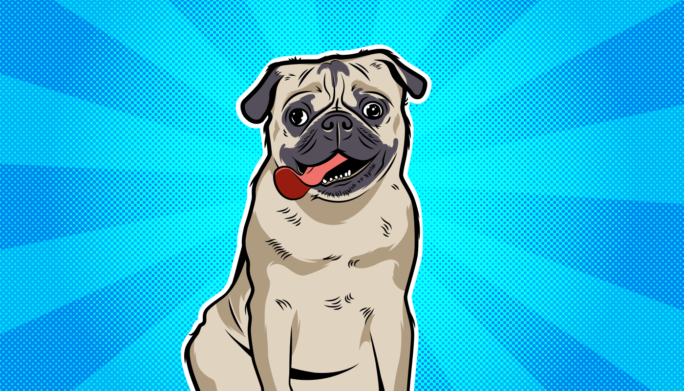
Interaction with therapy animals has been shown to reduce stress, so the Doggo Time! program was born to provide students with the benefits of spending time with wellness dogs.
Newly named as such, Doggo Time! required a visual identity. Since memes might be the art movement of the decade, DoggoLingo was relied upon to resonate with the post-secondary pupper lovers.
Pop art was a movement that incorporated imagery from mass culture, so it made sense to render dogs in this style. The overall art direction took inspiration from comics and Lichtenstein, illustrating dogs that you might see an Instagram account for.
Volunteers greeting students were identified by their Working Hooman pass.
Doggo Time! is silly, doesn’t always make sense, and brings in hundreds of students to pet a pupper.
On October 21, 2016, the SAMU Speaker Series brought Natasha Lyonne to speak on her life, conquering personal demons, and her experiences playing controversial roles.
At the time, her most notable character was Nicky Nichols in Netflix’s Orange is the New Black. As the event was also so close to Halloween, it seemed fitting that the colour palette should be limited shades of orange and black. Unable to send a headshot that was suitable for print, Natasha agreed to being illustrated for her poster.
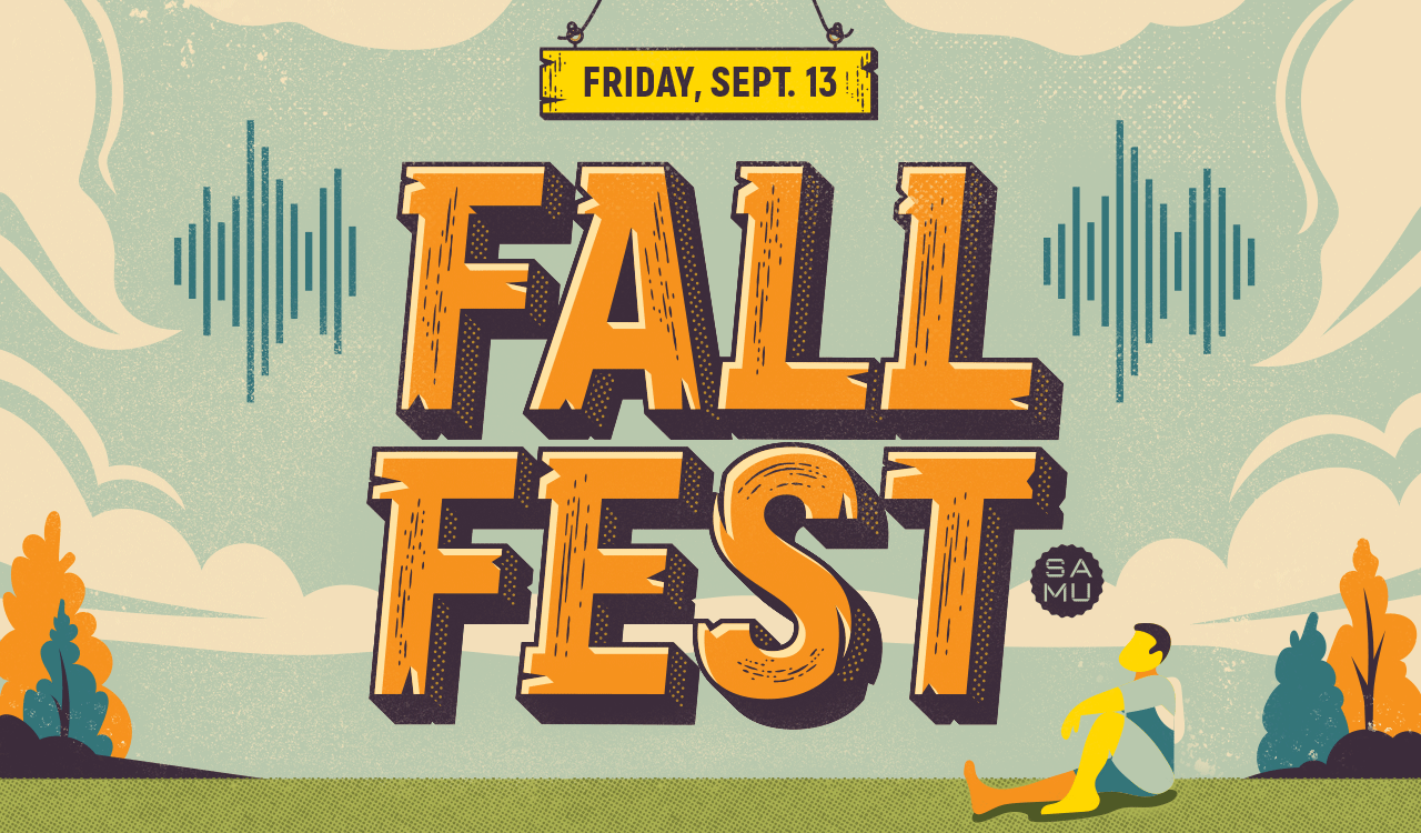
Fall Fest is an annual event put on by the Students’ Association of MacEwan University (SAMU), designed to be the quintessential back-to-school party.
Every year, the challenge is to create a new look that caters to the tastes of post-secondary students. Unable to find a font that had the look needed, I created custom type for the Fall Fest wordmark that would complement the illustrated environment.
Sadly, this Speaker Series event was cancelled, but this comic-inspired illustration was a labour of love and a fun experiment. As a nod to Archie comics, Lili Reinhart (Betty) and Camila Mendes (Veronica) from the CW's Riverdale were illustrated out of respect to the characters they play.
Cover artwork created for Eggshells, an alternative rock track about a guy in love with his parole officer.
The client trusted me to art direct and follow my intuition, which resulted in this delusional dude with his head in the clouds, dreaming of his lady of the law.